OVERVIEW
Union Station L.A. is the main train station in Los Angeles, rich in history. However, its current brand identity lacks excitement, failing to attract visitors. Preserving its historical significance is essential, yet it's not sufficient.
DESIGN CONCEPT / STRATEGY
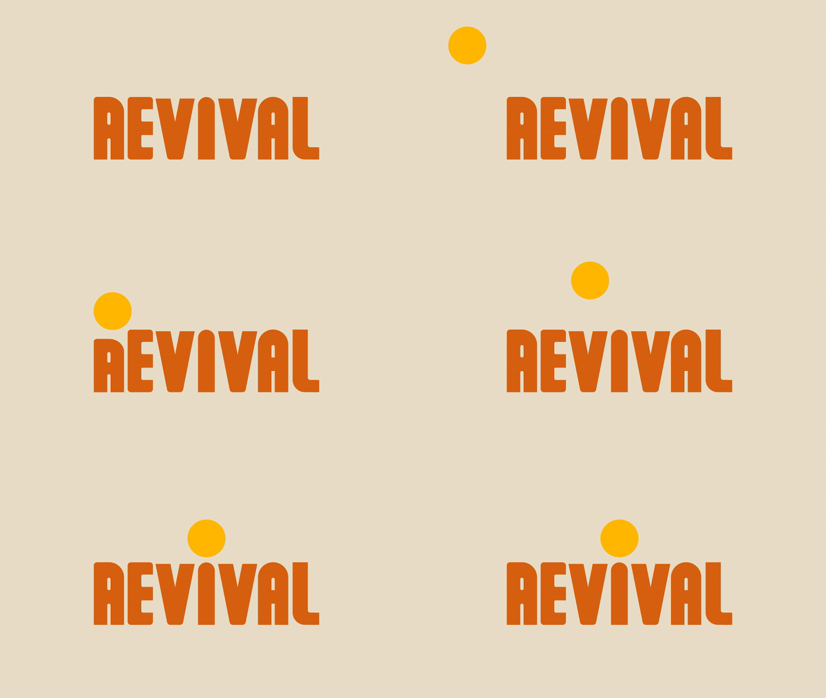
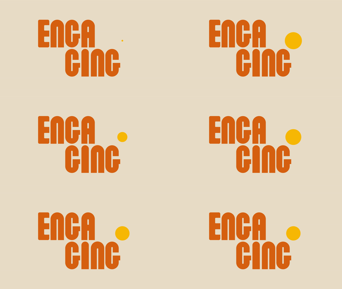
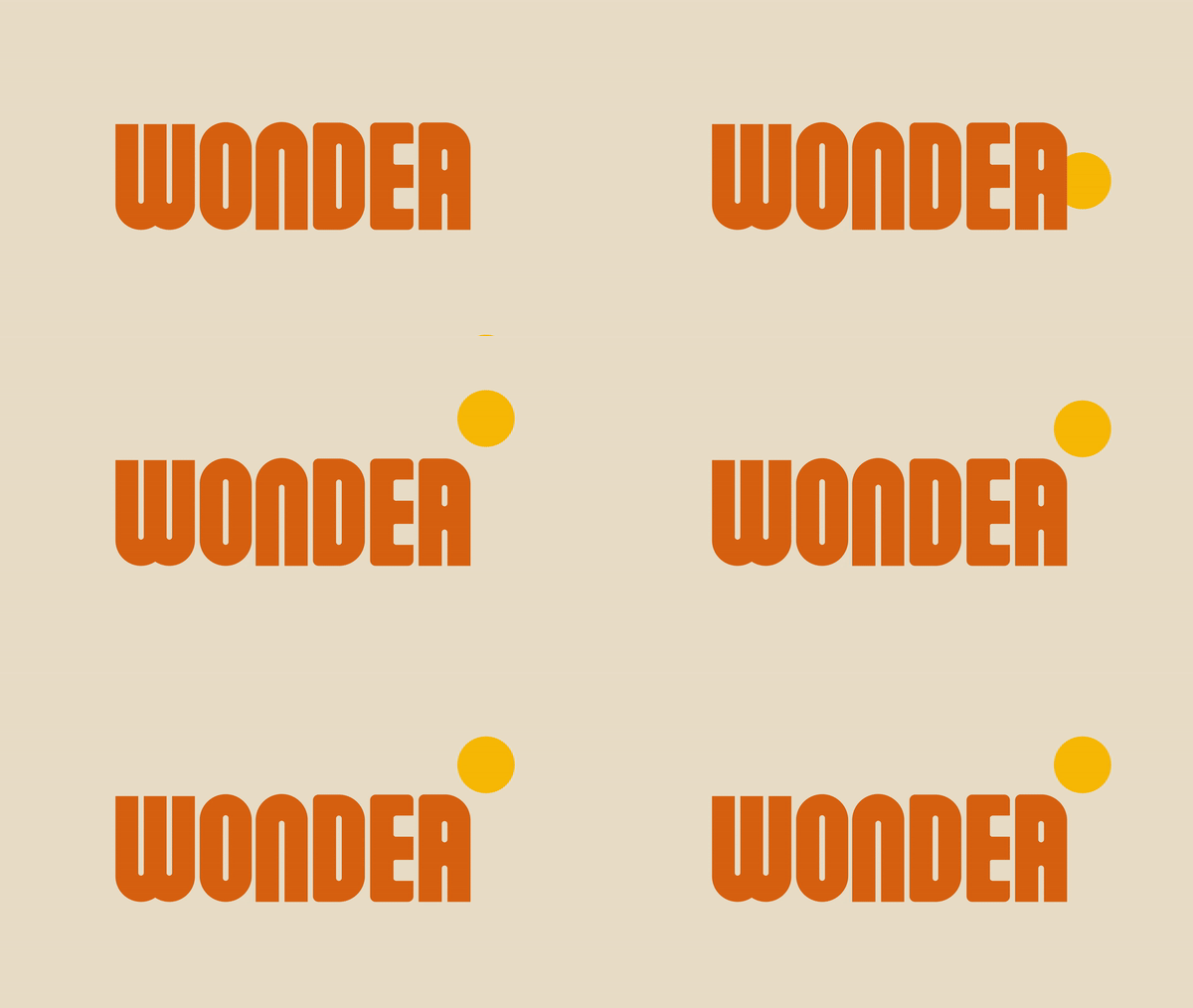
My goal is to transform Union Station into a more engaging, vibrant, and inspiring destination. The design concept centers around revitalizing its deep historical significance. By infusing engaging and wondrous elements, it creates a blend of the station's rich heritage with a contemporary and attractive experience for all who encounter it.
LOGO
The logo involves crafting the word “union” to capture the station’s distinctive exterior. It also symbolizes the railway, which is the main function of the station.
TYPEFACE
The custom typeface- Union San, drawn from the unique letterforms of the “union” logo, establishes a consistent visual language across key elements like the title page.
BRAND ATTRIBUTE
POSTER
The posters show the brand's commitment to preserving history, revitalizing its significance, and embracing future travels. The images highlight the diverse travel possibilities.
GRAPHIC STYLE
The curved arc embodies the railway, which echoes architectural contours, and the yellow dot signifies the destination, emphasizes the iconic clock.